AEROGP

AEROGP

AEROGP

// 4th Semester Communication Design // Finn Sigg, Jan Lauer and Ethan Harrison

// 4th Semester Communication Design

// Finn Sigg, Jan Lauer and Ethan Harrison

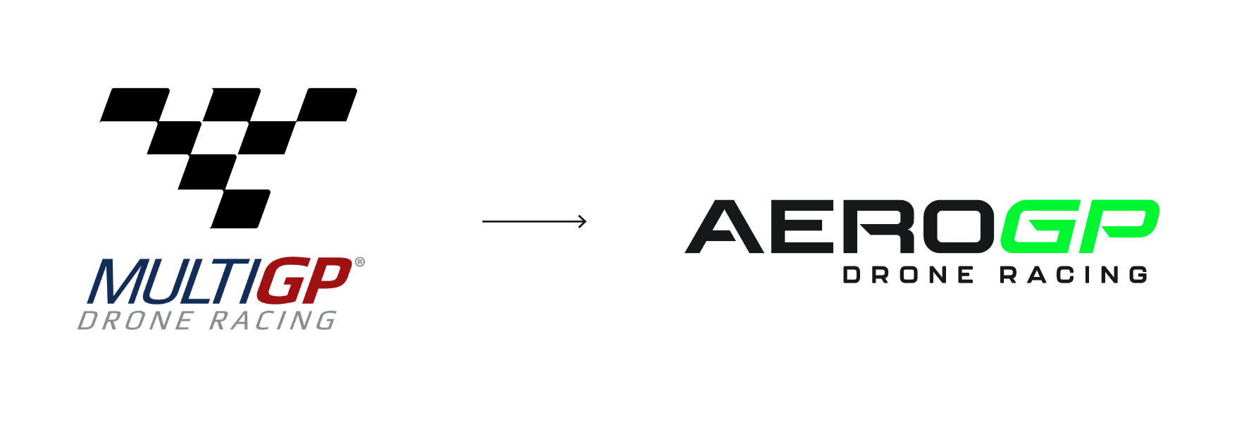
This project focused on updating and improving the existing appearance of a real brand. Based on the brand MultiGP, we redesigned all relevant elements. In this process, the entire brand image and name changed.
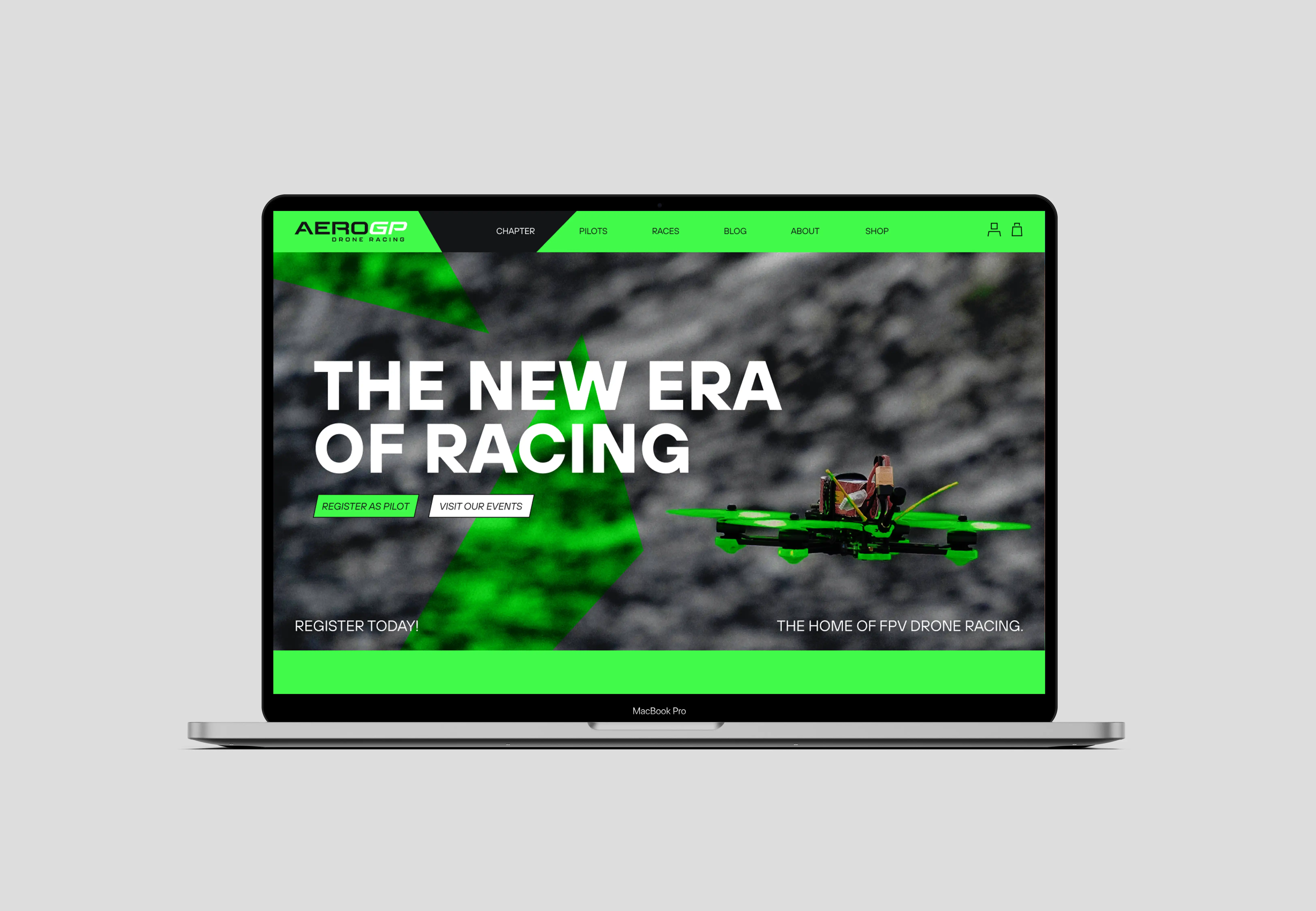
This project focused on updating and improving the existing appearance of a real brand. Based on the brand MultiGP, we redesigned all relevant elements. In this process, the entire brand image and name changed.
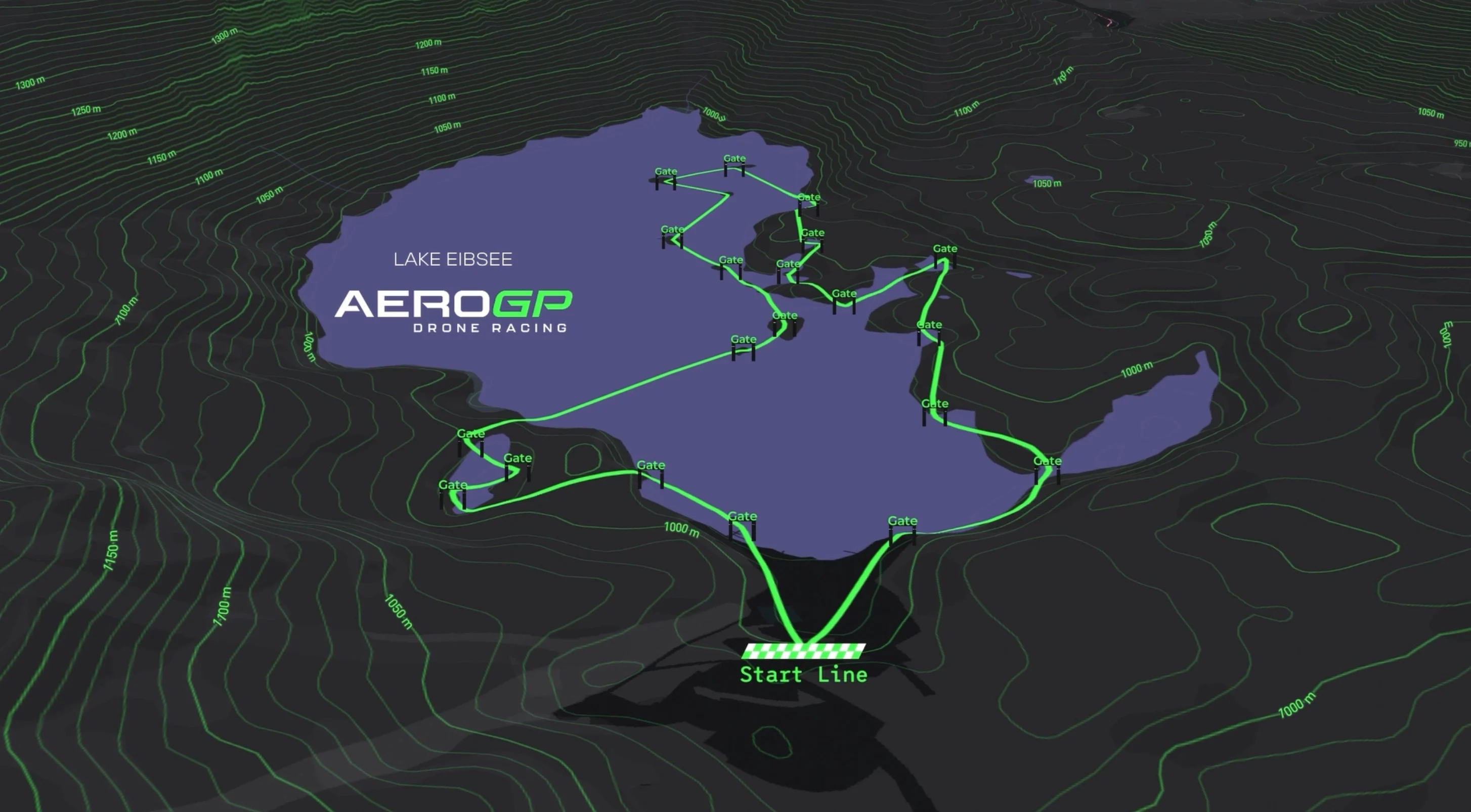
This project focused on updating and improving the existing appearance of a real brand. Based on the brand MultiGP, we redesigned all relevant elements. In this process, the entire brand image and name changed.
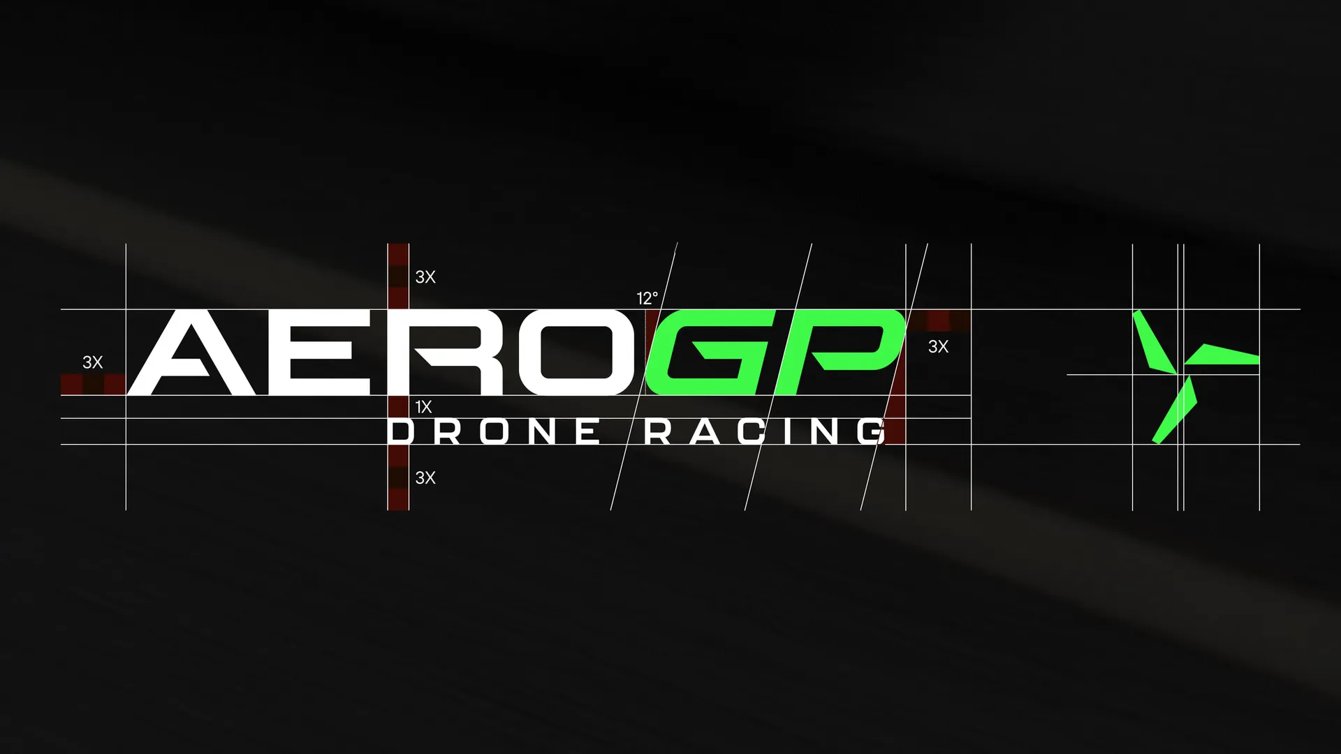
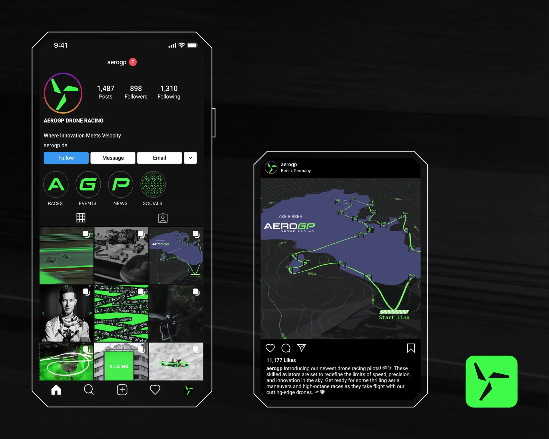
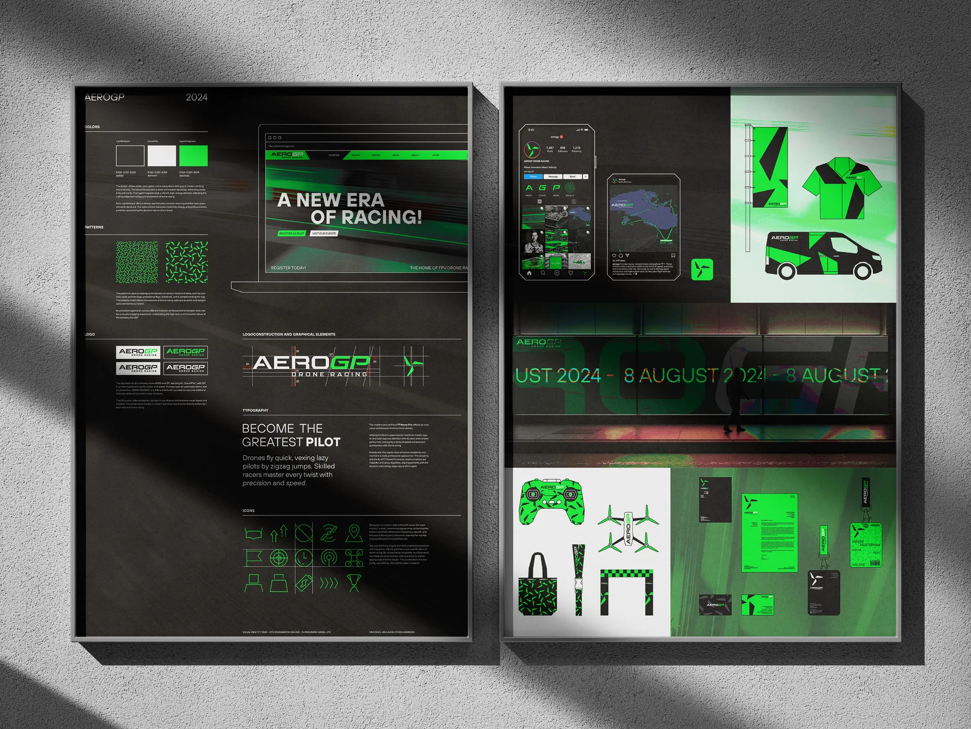
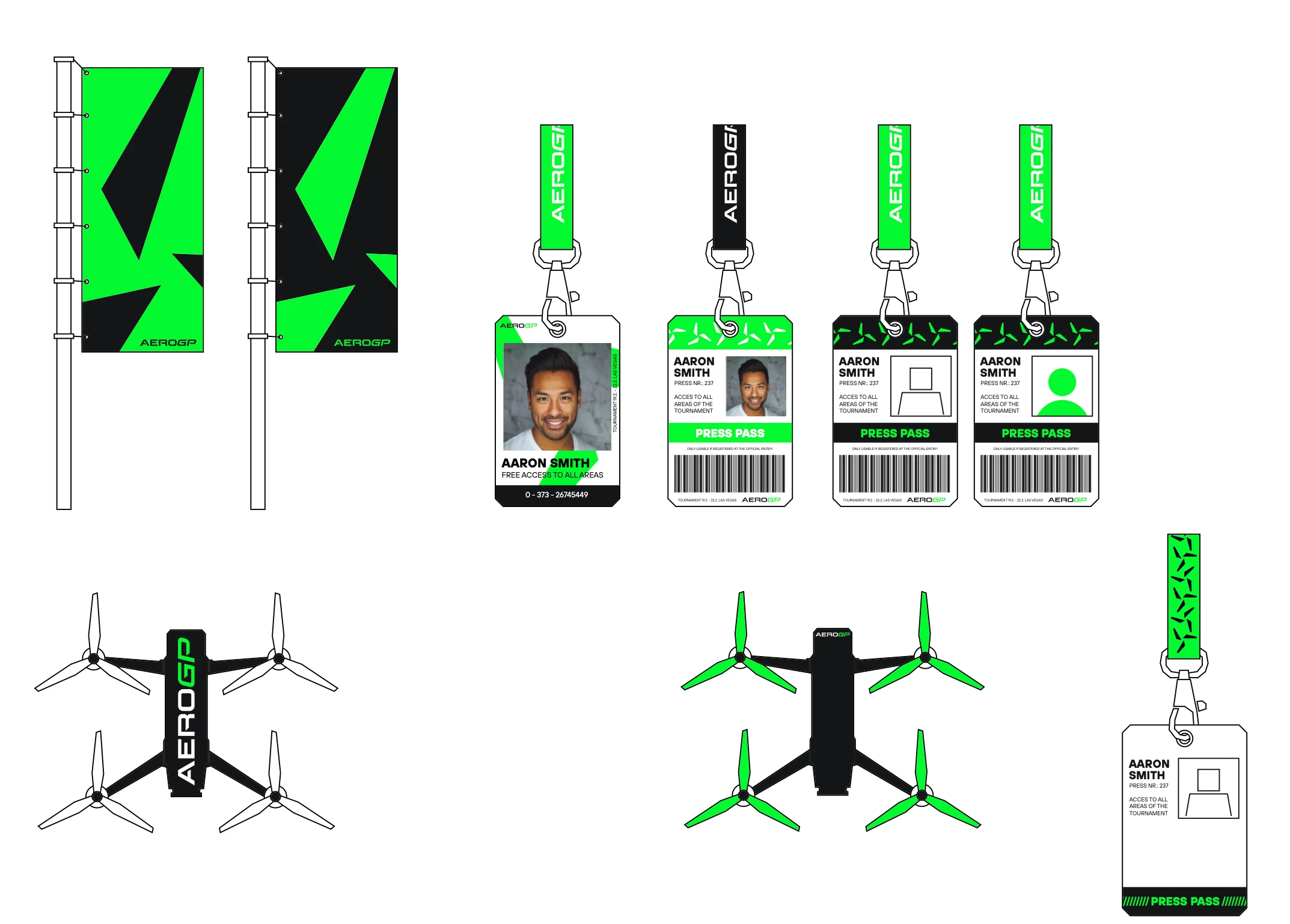
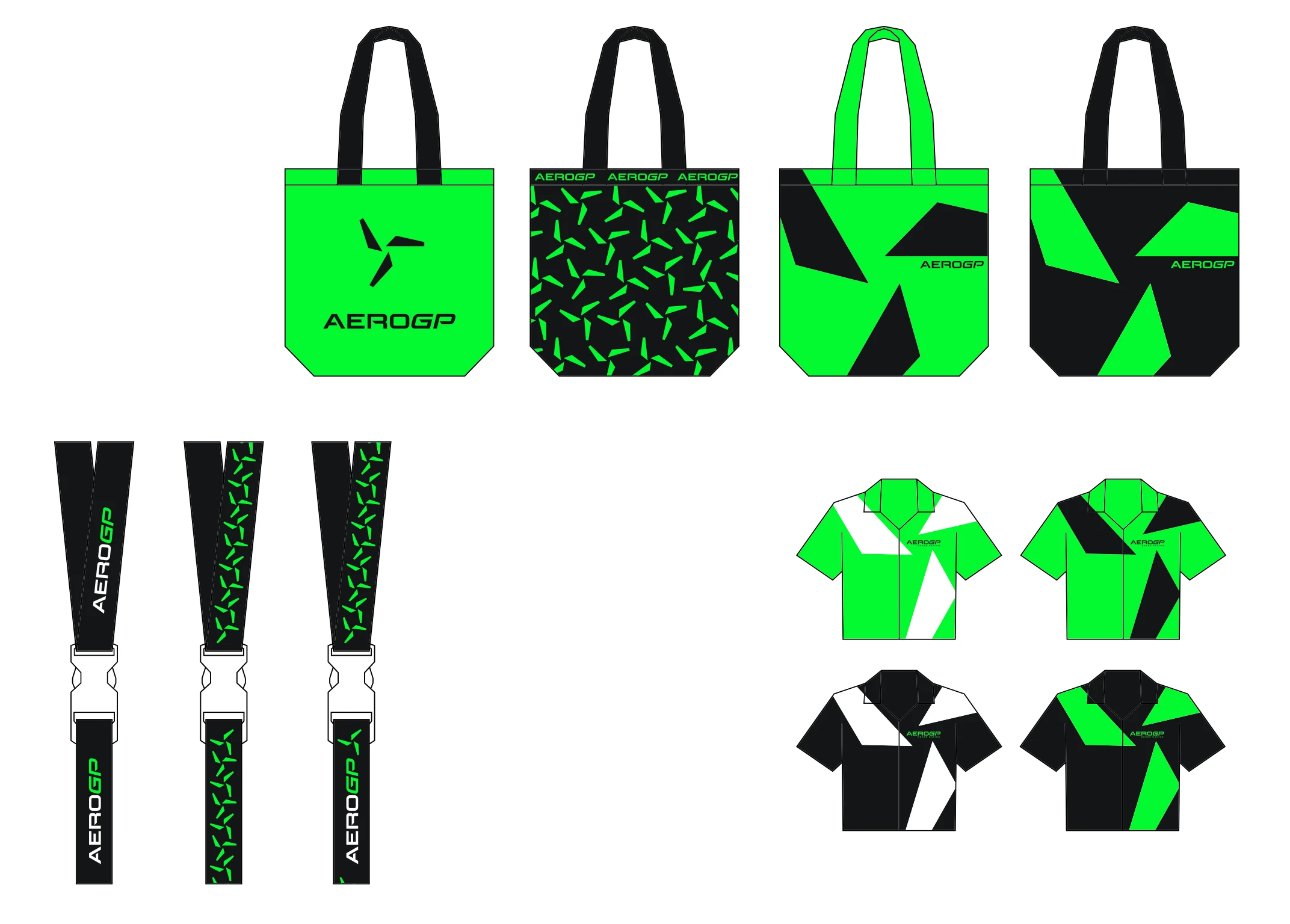
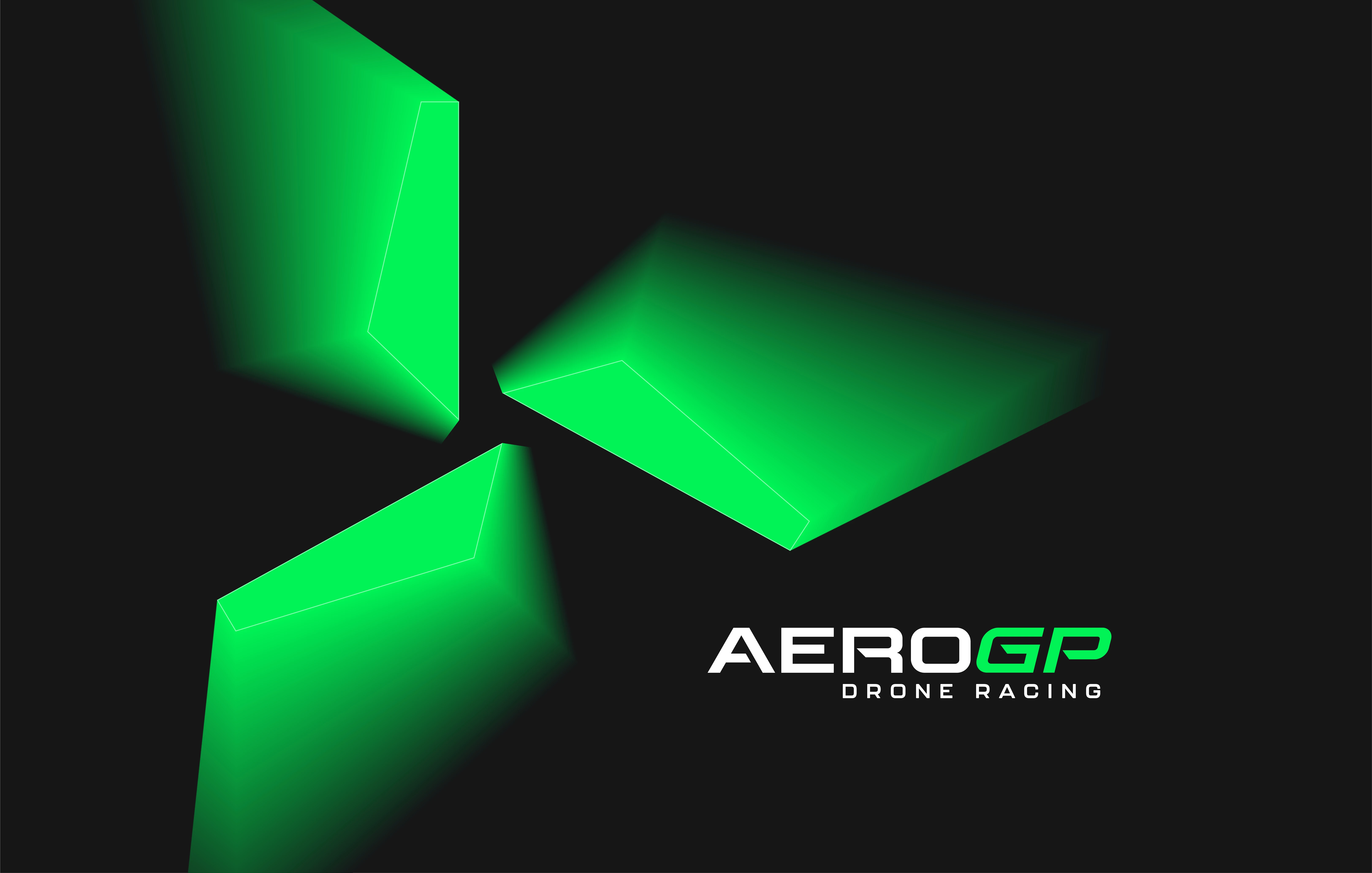
In general, our goal was to bring more life to the brand that stands for drone racing. The visual language should convey more action and speed. This should also be reflected in the choice of font, colors, and the logo. The neon green quickly attracts attention and appears dynamic. Moreover, it creates a good sense of cohesion among the different media. The logo still consists of both an image and a word mark, but they do not always have to be shown together. The image mark should suggest the rotors of the drones, thus fitting the theme very well. An interesting medium in this project was the map of a course. We designed a 3D map of a sample course.

AEROGP

// 4th Semester Communication Design // Finn Sigg, Jan Lauer and Ethan Harrison

This project focused on updating and improving the existing appearance of a real brand. Based on the brand MultiGP, we redesigned all relevant elements. In this process, the entire brand image and name changed.
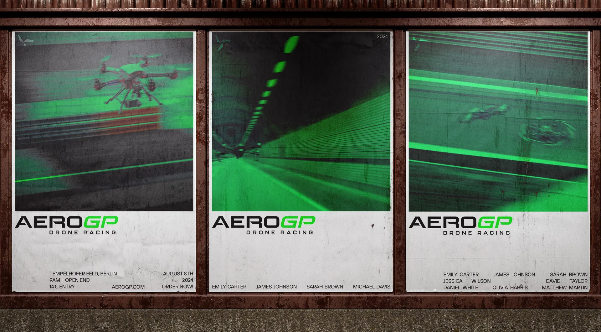
In general, our goal was to bring more life to the brand that stands for drone racing. The visual language should convey more action and speed. This should also be reflected in the choice of font, colors, and the logo. The neon green quickly attracts attention and appears dynamic. Moreover, it creates a good sense of cohesion among the different media. The logo still consists of both an image and a word mark, but they do not always have to be shown together. The image mark should suggest the rotors of the drones, thus fitting the theme very well. An interesting medium in this project was the map of a course. We designed a 3D map of a sample course.

Create a free website with Framer, the website builder loved by startups, designers and agencies.